

![Important CSS concepts[3/5] - MEDIA QUERY](https://cdn.hashnode.com/res/hashnode/image/stock/unsplash/2mc2B5iX6as/upload/98d51d5389561bd831469194b88159a4.jpeg?w=1600&h=840&fit=crop&crop=entropy&auto=compress,format&format=webp)


Table of contents
This article will cover Media Query in CSS.
What is Media Query?
CSS Media queries are a way to target browsers by certain characteristics, features, and user preferences, then apply styles or run other code based on those things. Perhaps the most common media queries in the world are those that target particular viewport ranges and apply custom styles, which birthed the whole idea of responsive design.
You can add multiple media queries within a stylesheet, tweaking your whole layout or parts of it to best suit the various screen sizes. The points at which a media query is introduced, and the layout changed, are known as breakpoints.
A common approach when using Media Queries is to create a simple single-column layout for narrow-screen devices (e.g. mobile phones), then check for wider screens and implement a multiple-column layout when you know that you have enough screen width to handle it.
We need not create multiple CSS media query breakpoints for every device width. This approach was used earlier for creating a responsive website when there were fewer devices in the market.
With many devices rolling out, it’s impractical to cover all the new devices for applying CSS breakpoints. Rather, try to choose breakpoints based on the web design and target devices that are extensively used by the audience in the target markets.
Some common breakpoints for devices with different screen sizes are:
320px — 480px: Mobile devices
481px — 768px: iPads, Tablets
769px — 1024px: Small screens, laptops
1025px — 1200px: Desktops, large screens
1201px and more — Extra large screens, TV
Using the CSS breakpoints mentioned above, you can create a simplified and manageable responsive website.
eg:
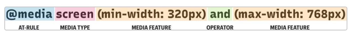
@media screen (min-width: 30em) and (max-width: 80em) {
  body {
    background-color: purple;
  }
}
The above example will make the background colour of the body into purple when the screen size is between 30em to 80em.
You can toggle the below screen by clicking on CSS and results and you can see, on screen change the visuals change.
There's also an accessibility part where we can choose the theme of the page, whether we want it dark or light.
it happens due to prefers-color-scheme property.
Property:
body {
  --bg-color: white;
  --text-color: black;

  background-color: var(--bg-color);
  color: var(--text-color);
}

@media screen and (prefers-color-scheme: dark) {
  body {
    --bg-color: black;
    --text-color: white;
  }
}
In the above example, the page will load in white, but if the user has preferences chosen to dark theme, then the page will load with black BG colour. This happens due to prefers-color-scheme: dark property.
we can deep dive into a lot more properties, here:
https://css-tricks.com/a-complete-guide-to-css-media-queries/