

![Important CSS concepts[4/5] - GRID](https://cdn.hashnode.com/res/hashnode/image/stock/unsplash/_Y3IuVbPpmU/upload/05bdc402c36fe47451d41e5ed49249ed.jpeg?w=1600&h=840&fit=crop&crop=entropy&auto=compress,format&format=webp)


Table of contents
- 1. Display:grid:
- 2. Grid-template-rows & grid-template-columns:
- 3. Grid-template-areas:
- 3. Grid-template:
- 4. Gap:
- 5. Justify-items/justify-content:
- 6. Align-items/Align-content:
- 7. Place-items/ Place-content:
- 8. Grid-auto-rows:
- 9. Grid-auto-flow:
- 10.Grid:
- Item Properties:
- 1.Grid-column-start/end & grid-row-start/end:
- 2. Grid-column/grid-row:
- 3. Grid area:
- 4. Justify/align/Place-self:
- Sizing keywords/ functions:
- Autofill vs Autofit:
This article will cover the grid concept.
What is a grid in CSS?
CSS Grid Layout is a two-dimensional grid-based layout system that, compared to any web layout system of the past, completely changes the way we design user interfaces. CSS has always been used to lay out our web pages, but it’s never done a very good job of it. First, we used tables, then floats, positioning and inline-block, but all of these methods were essentially hacks and left out a lot of important functionality (vertical centring, for instance). Flexbox is also a very great layout tool, but its one-directional flow has different use cases.
Let's go through all the major properties in this article.
1. Display:grid:
To make a container, a grid, we need to make the display a grid.
.container {
  display: grid | inline-grid;
}
*The difference between the values inline-grid and grid is that the inline-grid will make the element inline while the grid will make it a block-level element.
2. Grid-template-rows & grid-template-columns:
Defines the columns and rows of the grid with a space-separated list of values. The values represent the track size, and the space between them represents the grid line.
we can write in the following ways:
 grid-template-columns: repeat(4,200px);
 grid-template-columns: 100px 100px auto 200px;
 grid-template-columns: repeat(3,1fr);
in container class, we have added:
  grid-template-columns: repeat(4, 200px);
  grid-template-rows: repeat(3, 50px);

//we can use repeat if we need the same length for all the items.
in container2 class, we have added:
grid-template-columns: 100px 100px auto 200px;
grid-template-rows: repeat(3, 1fr);

*we can use manual values for each column and auto will increase the colm width according to the width of the parent container or screen size.
*also we can use fr if we dont want to explicitly mention item width, fr will automatically assign itself the width based upon the values of othjer items.
for eg:
if the parent container is 100px wide, and there are 3 items inside it with 1fr width it will automatically give equal 1/3 width of parent container to each item, now, if we shrink the parent width , items will shrink as well.
3. Grid-template-areas:
Defines a grid template by referencing the names of the grid areas which are specified with the grid-area property. Repeating the name of a grid area causes the content to span those cells. A period signifies an empty cell. The syntax itself provides a visualization of the structure of the grid.
3. Grid-template:
Grid-template Shorthand for setting grid-template-rows, grid-template-columns in a single declaration.
.container {
  grid-template:
    25px 25px [rows] / auto 50px auto [columns];
}
.container {
  grid-template-rows: 25px 25px ;
  grid-template-columns: auto 50px auto;

}
4. Gap:
A shorthand for row-gap and column-gap. It is used to provide a gap between rows and columns in a grid.
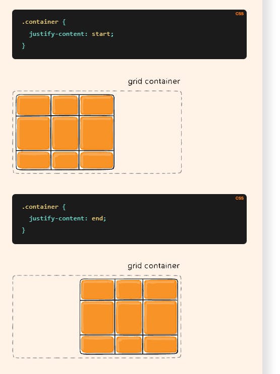
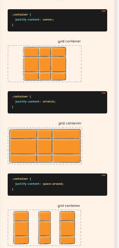
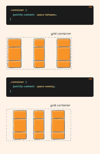
5. Justify-items/justify-content:
Justify-items aligns grid items along rows and justify-content align all the grids to align themselves along rows.
.container {
  justify-items: start | end | center | stretch;
 justify-content: start | end | center | stretch | space-around | space-between | space-evenly;
}
Justify-items example:

Justify-content examples:
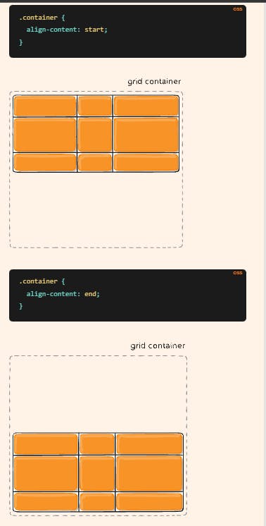
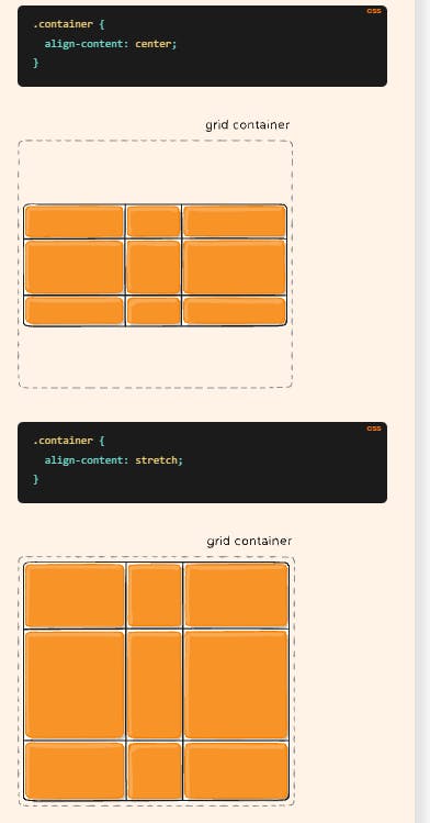
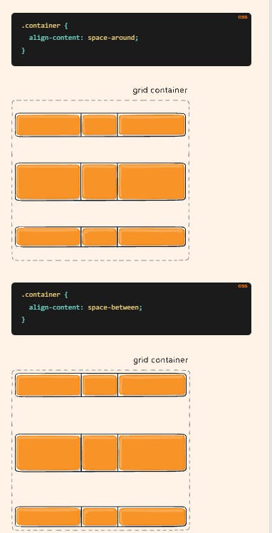
6. Align-items/Align-content:
Align-content aligns all the grid items alongside the column and align-items aligns individual grid items along columns.
Align-items example:

Align-content example:

7. Place-items/ Place-content:
Place-items sets both the align-items and justify-items properties in a single declaration.
Place-content sets both the align-content and justify-content properties in a single declaration.
8. Grid-auto-rows:
Specifies the size of any auto-generated grid tracks (aka implicit grid tracks). Implicit tracks get created when there are more grid items than cells in the grid or when a grid item is placed outside of the explicit grid.
9. Grid-auto-flow:
If you have grid items that you don’t explicitly place on the grid, the auto-placement algorithm kicks in to automatically place the items in rows by default. This property controls how the auto-placement algorithm works.
values:
.container {
  grid-auto-flow: row | column | row dense | column dense;
}
row– tells the auto-placement algorithm to fill in each row in turn, adding new rows as necessary (default)column– tells the auto-placement algorithm to fill in each column in turn, adding new columns as necessarydense– tells the auto-placement algorithm to attempt to fill in holes earlier in the grid if smaller items come up later
*Note that dense only changes the visual order of your items and might cause them to appear out of order, which is bad for accessibility.
10.Grid:
Shorthand for setting all of the following properties in a single declaration: grid-template-rows, grid-template-columns, grid-template-areas, grid-auto-rows, grid-auto-columns, and grid-auto-flow.
Here we annotate as: row related properties/column related properties.
Item Properties:
These Properties are applied to individual items instead of the whole grid itself:
1.Grid-column-start/end & grid-row-start/end:
These specify the start and end values we can set for an item inside a grid.
This is useful when we want to align items accordingly.
we configure it as below:
if we want an item to expand from line 1 to line 4 we can write:
.item {
  grid-row-start: 1;
  grid-row-end: 4;
}
it is the same with columns as well.
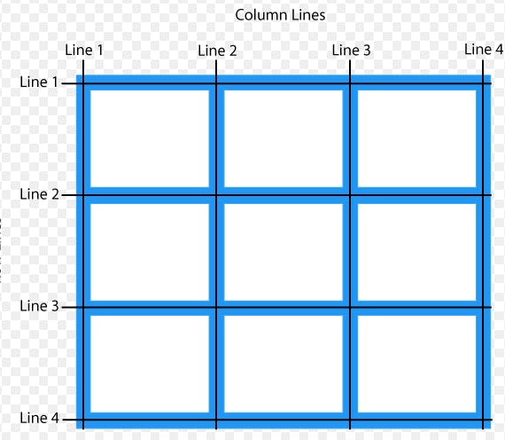
example:
2. Grid-column/grid-row:
This is the shorthand for the above property. We can write as:
.item {
  grid-column: <start-line> / <end-line> | <start-line> / span <value>;
  grid-row: <start-line> / <end-line> | <start-line> / span <value>;
}
The difference between span and directly writing a number is, the span value is considered +1 the line number we want the item to be expanded. If we want an item to expand till line 5, we can either write: 1/5 or 1/ span 4.
3. Grid area:
It is a shorthand for the above property, i.e. grid-column/grid-row.
We can annotate as :
.item {
  grid-area: <row-start> / <column-start> / <row-end> / <column-end>;
}
4. Justify/align/Place-self:
Justify-self sets the items alongside the rows of the grid, align-self aligns the items alongside the columns and place-self aligns the items both horizontally and vertically.
/* for align-self and justify-self*/
.item {
  align-self or justify-self: start | end | center | stretch;
}
/* for place-self*/
.item {
 place-self : align-self/justify-self;
}
Sizing keywords/ functions:
When sizing rows and columns, you can use all the lengths you are used to, like px, rem, %, etc, but you also have keywords:
min-content: the minimum size of the content. Imagine a line of text like “E pluribus unum”, the min-content is likely the width of the word “unum”.max-content: the maximum size of the content. Imagine the sentence above, themax-contentis the length of the whole sentenceauto: this keyword is a lot likefrunits, except that they “lose” the fight in sizing againstfrunits when allocating the remaining space.fit-content: use the space available, but never less than min-content and never more thanmax-content.
Sizing Function: minmax():
We use minmax() function so that we can have a min width to our rows/columns and a max width as well.
parameters are as: minimum value/maximum value;
it can be applied top both: grid-template-columns and grid-template-rows.
Autofill vs Autofit:
Auto-fill FILLS the row with as many columns as it can fit. So it creates implicit columns whenever a new column can fit because it’s trying to FILL the row with as many columns as it can. The newly added columns can and may be empty, but they will still occupy a designated space in the row.
auto-fit FITS the CURRENTLY AVAILABLE columns into the space by expanding them so that they take up any available space. The browser does that after FILLING that extra space with extra columns (as with auto-fill ) and then collapsing the empty ones.