![Important CSS concepts[2/5] - FLEXBOX](https://cdn.hashnode.com/res/hashnode/image/stock/unsplash/yVl930PFMsQ/upload/b50a58ab3b5c38bedc9cbd06463fd7b5.jpeg?w=1600&h=840&fit=crop&crop=entropy&auto=compress,format&format=webp)


This article will cover flex in CSS.
What is flex?
The main idea behind the flex layout is to give the container the ability to alter its items’ width/height (and order) to best fill the available space (mostly to accommodate all kinds of display devices and screen sizes). A flex container expands items to fill available free space or shrinks them to prevent overflow.
An element is called a flex-box if it has a property display: flex, applied on the container as shown below:
.container {
  display: flex; /* or inline-flex */
}
There are different properties for a flex-box, and we will go one by one through them.
1. flex-direction:
The flex-direction tells us the direction of flex, it tells from which direction the items will start on the screen:
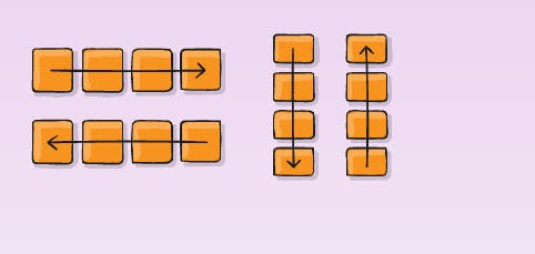
Properties:
.container {
  flex-direction: row | row-reverse | column | column-reverse;
}
Demo:
2. Flex-wrap:
Flex-wrap wraps the items when we shrink the screen size. It will arrange itself automatically, without disturbing the look of the items.

Properties:
.container {
  flex-wrap: nowrap | wrap | wrap-reverse;
}
Demo:
3.Flex-flow:
This is a combo of flex-direction and flex-wrap.
Properties :
.container {
  flex-flow: column wrap | row wrap | column-reverse nowrap ; /*etc etc*/
}
Demo:
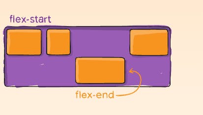
4.Justify-content:
It makes the row items align in the centre, start, and end, also it can give spaces between items.
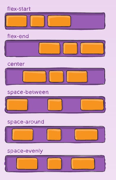
Properties:
.container {
  justify-content: flex-start | flex-end | center | space-between | space-around | space-evenly | start | end | left | right ... + safe | unsafe;
}
There are also two additional keywords you can pair with these values: safe and unsafe. Using safe ensures that however you do this type of positioning, you can’t push an element such that it renders off-screen (e.g. off the top) in such a way the content can’t be scrolled too (called “data loss”).
Demo:
5.Align-items:
It works like Justify-content but in a horizontal manner. with base align as a difference in the property. Baseline makes all the text inside the box, have a common imaginary base.
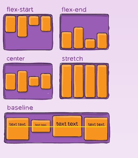
Properties:
.container {
  align-items: stretch | flex-start | flex-end | center | baseline | first baseline | last baseline | start | end | self-start | self-end + ... safe | unsafe;
}
Demo:
6.Align-content:
This works similarly to Justify-content, just it makes all the items in the container align row-wise instead of the items in a single row.

properties:
.container {
  align-content: flex-start | flex-end | center | space-between | space-around | space-evenly | stretch | start | end | baseline | first baseline | last baseline + ... safe | unsafe;
}
demo:
Note: This property only takes effect on multi-line flexible containers, where flex-wrap is set to either wrap or wrap-reverse). A single-line flexible container (i.e. where flex-wrap is set to its default value, no-wrap) will not reflect align-content.
7.Gap:
The gap property explicitly controls the space between flex items. It applies that spacing only between items not on the outer edges.
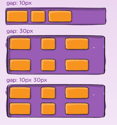
Properties:
.container {
  gap: 10px;
  gap: 10px 20px; /* row-gap column gap */
  row-gap: 10px;
  column-gap: 20px;
}
Demo:
The following Properties apply to only flex items, not the flex container.
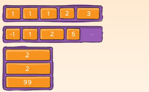
8.Order:
Order property values indicate which item will come last based on the value of the order, any item which has maximum order value will come last in the direction of flex. It has a relative value not absolute, meaning it doesn't mean we increase the order value the more the item will be moved farthest away, it just compares the magnitude of the order value and arranges items accordingly.
Properties:
.item {
  order: 5; /* default is 0 */
}
Demo:
9.Flex-grow:
This property will make the flex item grow in width, the width of the item will be base on the magnitude of the value.
Negative numbers are invalid.

Properties:
.item {
  flex-grow: 4; /* default 0 */
}
Demo:
10.Flex-shrink:
This property shrinks the item when decreasing the port view [screen size]. The first item which will be shrunk would be the one, on which this property is applied.
Negative numbers are invalid.
Properties:
.item {
  flex-shrink: 3; /* default 1 */
}
Demo:
11.Align-self:
This makes a particular flex item align separately.
Properties:
.item {
  align-self: auto | flex-start | flex-end | center | baseline | stretch;
}
Demo:
These were the most important flex properties.
If you think you have understood it all, then let's play a game!